KYLE PHELPS

HPE Enterprise Forward

HPE needed an interactive branded experience that delivered various content types on one platform. This platform should provide a seamless user experience that draws together content types and channels into one easily navigable place.

CLIENT:

Hewlett Packard Enterprise

TASKS:

Information Architecture, Design

HPE Mobile Home HPE Mobile Article HPE Iphone Contact Brand Guidelines HPE

Wireframes

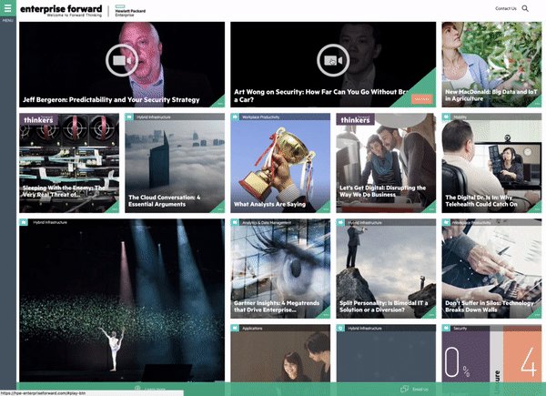
The site uses a modular grid that provides visual consistency and rhythm. This consistency allows the grid to handle a wide range of content types. A visual hierarchy was established by varying the sizes of the content boxes and their associated elements. This allows the user to quickly scan over the various content boxes without suffering from design monotony.

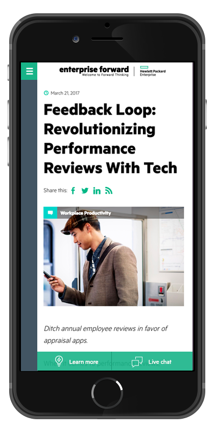
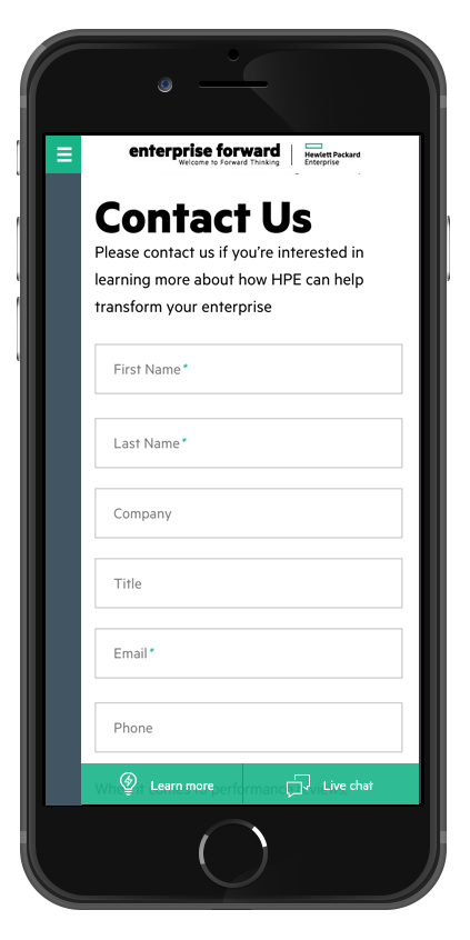
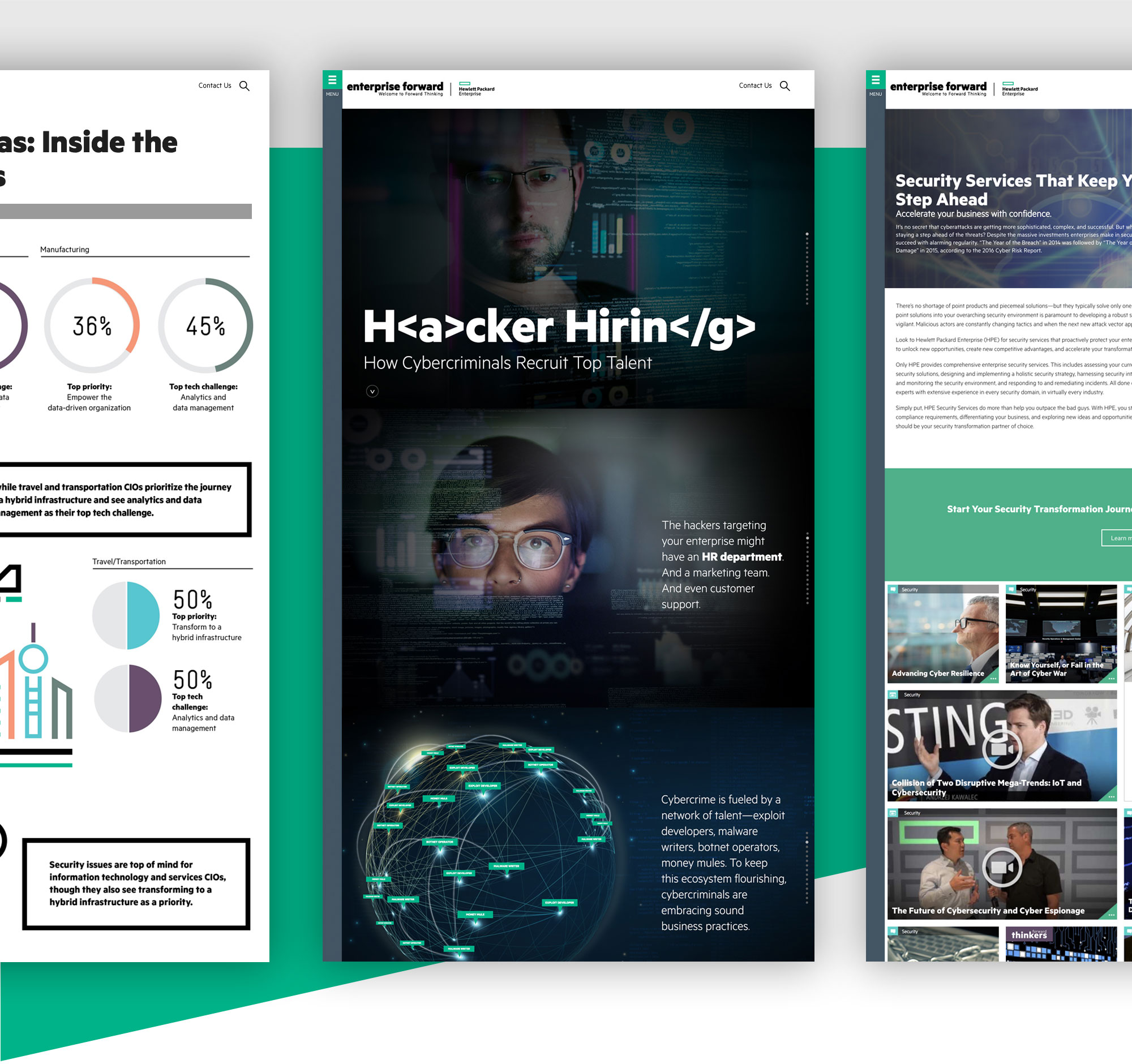
The goal of the platform is to establish HPE as a thought leader in the enterprise services industry and drive more leads. To do this the user flow starts by driving the customers to single article pages. Once the customer is on the single article page, call to actions will pop up or split the content funneling them to product specific content. The product content pages give the user an option to take an assessment, read more articles, or contact HPE.

Content Menu

To avoid cluttering of the UI, the menu is hidden via the hamburger menu. When the menu is clicked, a drawer pushes out from the side squeezing the content section. The content section is shrunk instead of being pushed off the page so that the customer can filter the content without hiding any of the articles. The menu contains several sorting options that the customer can customize to suit their needs. A taxonomy was established so HPE product teams could presort the site and send out direct links to their customers.

Animated Grid

The articles animate and reshuffle according to the various sort options. This animated interaction makes the website appear faster and more responsive. Videos can be viewed from the homepage or on their own dedicated landing pages.